Saturday, July 27
MAIN PROGRAM, DAY 2
11:50–12:00
Opening Remarks
SOTA Board
12:00–12:30
Ars Scribendi
Akiem Helmling & Sami Kortemäki
Ars Scribere is the second part of a triptych focusing on the latest typeface designed by Underware, Scribo. Developed between 2019 and 2023, Scribo is Underware’s most complex font to date. The first presentation took place at ATypI Paris 2023 (see youtube) and primarily focused on the process of designing and engineering Scribo. This talk will center on the art of writing more broadly (including the presentation of new typefaces which have never been shown in public before). About Scribo: Scribo comprises a collection of static, variable, and color fonts. It is suitable for typesetting and writing text. In designing the font, Underware explored chirographical dynamics such as speed, velocity, and interruptions, integrating these elements into the variable fonts. To illustrate the complexity, this exploration resulted in a design space featuring over 100,000 unique locations.
12:30–12:50
Coffee Break
12:50–1:10
Designed With Love
Amira Hegazy
For the last three years I’ve explored Chicago’s unique neighborhoods looking at and learning from the distinctive typographic character of the communities. I’ve joined a graffiti crew, worked on lettering exercises with ex-gang members and studied sign painting to understand how community based typographic traditions differ from other methods in practice, form, and concept. Taking an ethnographic approach, I conducted studio visits and interviews where I heard people continuously discuss love and how it was core to their practice. Love informs the words they tell each other, their letterforms code-switch seamlessly in public space if you are beloved. This research reveals how letterforms in Chicago’s neighborhoods amplify systems of care, safety, and love by promoting highly localized aesthetics. Making clear the differences between authentic and gentrified, the lived experience of community members, designers and artists build the case for counternarratives in community-based design traditions. Drawing on these design legacies, I’ll show how love, based in its radical, liberatory definitions, is a force for designing communities of growth, safety, and celebration.
1:10–1:30
BR20+: A Type/Cut/Screen/Print/Film/Show
Henrique Nardi & Marcos Mello
Brazilian culture is known for its lively and colorful nature, with a mix of rhythms and flavors that inspire art, design, and typography. The BR20+ project celebrates Brazil’s diversity by showcasing the work of contemporary type designers who have made significant contributions to Brazilian typography over the past two decades. The project includes a letterpress/screenprint poster with laser-cut Brazilian font matrices as the foundation for a multimedia art display, featuring workshops, exhibitions, and outdoor video projections.
1:30–1:50
Defend Corner Stores: Preserving the Vanishing Culture of Vernacular Hand-Painted Signage in the Commercial Settings of the Post-Katrina Landscape of New Orleans Through Typography and More
Anthony DelRosario
Ride along with Anthony DelRosario on a visual journey to document, preserve, and interpret the uniqueness of hand-painted signs on corner stores, neighborhood bars, and other places around New Orleans through the lens of a camera, the ink of printmaking, and the creation of computer typefaces.
1:50–2:10
Activating Queer Archives: The Currency of Queer Material Culture
Sabid Ali
Activating Queer Archives: The Currency of Queer Material Culture explores archival objects and print material that developed out of the queer liberation movements in North America. The presentation curates a history of artifacts discovered through queer archives and examines them for their use of typography, layout, language, and technology available at the time. Stamp Out is a design project where I highlight the queer liberation movement’s little-known ‘gay money’ phenomenon, a loosely-coordinated effort where dollar bills were once stamped with phrases like “Gay $$” and “Lesbian Money” to make visible the economic contributions of queer people. Conference attendees can gather following the presentation to use facsimiles of stamp designs found in archives and create prints on pink strips of paper sized to the dimensions of an American dollar bill. Embodying this deeply political practice considers the different components needed for producing ‘gay money’ stamps, in addition to the social relationships that these artifacts affect.
2:10–2:40
Coffee Break
2:40–3:00
European Typographic Proofreader: Typofix
Radek Sidun & Filip Blazek
Writing quotation marks, numbers, punctuation, spaces, or symbols is integral to every language. Specific typographic rules have been developed for each language for centuries, but in recent decades, they have been disregarded due to globalisation and the unification of software tools. The basis of this international cooperative project is to systematically describe the current typographic rules and practices of all 24 official EU languages, including minority languages, in the future, with the help of local professionals. This research aims to create a publicly accessible database of typographic rules, which will be followed by a web application for the general public as well as public and commercial institutions. The presentation will introduce the cooperation plan and open the discussion to gain attention from potential partners, especially among the technological software leaders in the field of typography; they are primarily from the USA. The Academy of Arts, Architecture and Design in Prague initiated and led the project.
3:00–3:20
The Color Era of Variable Fonts
Frida Medrano
Color is a fundamental design element, so why not unlock its potential in type? As our digital landscapes evolve, so should our typefaces. Step into the world of color with COLRv1 technology, where gradients, transparencies, and movement redefine the potentials of fonts. Join me in exploring the dynamic world of color and motion in type design. I’ll take you through my journey creating Kalnia Glaze, a COLRv1 variable font commissioned by Google Fonts. We’ll delve into the challenges and discoveries made while streamlining the process of creating color fonts, and discuss how to make typographic experimentation more enjoyable for designers. We’ll explore the format’s capabilities, challenges, and breakthroughs, and discuss why we need more fonts that embrace gradients. Let’s dive into the next generation of variable fonts and embrace the Color Era.
3:20–3:40
A Bite-Sized Welcome to Unicode
Kamilé Demir
In a field that covers so much ground yet is so niche, we naturally have areas that remain to be mysterious. One such area is Unicode, the character encoding standard that powers everything we do. Your familiarity with Unicode standard may depend on your role in this symphony of the fonts & type industry. However, even if character encoding is not something you find yourself dealing with in your day to day, understanding how it all works could prove beneficial to opening new doors in typography! Join us as we cover a bite-size introduction to Unicode, in just 20 minutes!
3:40–4:00
How an African Writing System Got Its First Display Font
Mark Jamra and Neil Patel
This is the story of how the first display font for the Adlam script was created in a collaboration between a major tech company, a global advertising agency, a specialist in African textiles, and 3 type designers based in London, UK and Portland, Maine. We’ll talk about the initial brain-melting brief, “adjusting” expectations, working our way into Fulani art to achieve a culturally-sensitive design, and creating the typeface that—to our great surprise—arrived on schedule. On top of all that, the changes occurring in real-time in a young, still-evolving writing system added a moving target to the challenge. Adlam is a relatively new script, having been invented in the 1980s. The available fonts had been made for user interfaces and book publications. Was it the right time to introduce an expressive headline font? If so, how would it be received by the Fulani people? We’ll take a look at what their reaction can teach us.
4:00–4:20
Coffee Break
4:20–4:40
Filling in the Gaps: Speculative Type History for an Underserved Script
Chris Skillern
Type history is all around us, in books, on signage, in popular culture. For Latin-based scripts in particular, a keen eye can start to detect how different styles of type and lettering developed over time. For other scripts, such as the Cherokee syllabary, no such roadmap exists. In fact, because of the policies of the United States, the syllabary spent almost 200 years in stasis. As a result, it is still most often represented today in a style reminiscent of the first Cherokee metal type from the 1820s. But what if the Cherokee language, and by extension the syllabary, had not been suppressed? How might Cherokee lettering and type styles have developed and evolved? Would the evolution mirror that of Latin type over the same time period, or would it diverge? Would there be Cherokee wood type? Thick Cherokee type specimen books? Expressive ghost signs on buildings in Cherokee towns? Join me for a thought experiment and an argument for how we can help to make a script more robust by considering what might have been.
4:40–5:00
From Bricks to Pixels: The Evolution of Banna’i Kufic
Sajad Amini
Exploring calligraphy’s roots in Islamic civilization reveals fascinating parallels to digital design. The Mu’tazila, an Islamic rationalist school, encouraged intellectual debate and rejected the human inability to analyze the past, future, and God itself. This, alongside Islamic aniconism, led scholars like Ibn Muqla to develop unique scripts, measuring systems, and logic. Thriving Islamic culture saw calligraphy flourish. Persian architecture incorporated styles like Banna’i Kufic, inspired by the geometric shapes of bricks. Notably, Square Kufic’s minimalist design coexisted with intricate scripts like Thuluth. Pushing typographic boundaries, diacritics were omitted, allowing intricate formations of holy names. Square Kufic’s structure resembles pixels, the building blocks of early digital art. Banna’i Kufic’s modularity ensures its continued use today. This presentation delves into Banna’i Kufic’s history, structure, and aesthetics through a design lens.
5:00–5:20
Tessellated Square Kufic
Mamoun Sakkal
Square Kufic calligraphy has a long history rich in appealing and inspiring graphic ideas. “Tessellated Text” is one where the shape of words is manipulated so that the space between the letters also reads as text. In this illustrated presentation, I will review the history of this intriguing concept starting with a single word tessellation in a hexagon found early in 13th century Anatolia and spreading throughout the Middle East where more than a dozen variations are used and reused up through the present time. This design is followed shortly by a two-word tessellation in a square from Damascus, also to become a widespread design over the 14th to 20th centuries. Other tessellated designs will be presented, culminating in full phrase tessellations from Muslim Spain in the 14th century and from Ottoman Turkey in the 16th century. I will also share my own tessellated typographic work based on this concept in a series of modern designs using Arabic script to illustrate the name Escher and influenced by the work of M.C. Escher himself. This portfolio of 16 plates is also available for display as a separate art exhibit.
5:20–5:40
The Problems Type Face With VR Now
Min-Young Kim
Typographic research regarding the new technology should always consider multiscript typesetting, because there are users all over the world. Whenever there is a new form of technology, the evolution of typography bifurcates: either the existing convention of typography remains, or the need for new convention arises. For example, even within the same environment of “screen,” we were able to adopt the traditional convention on e-books from printed books; however, the new convention was invented for responsive environments such as social media and web on smartphones. And now there is another new form—VR & AR. Global companies have been developing XR devices and softwares, but the focus is still on the technology than legibility of type, although it significantly affects the experience of the device and software. The talk will be an introduction to the new perspective on how legibility is defined in VR environment, with a walk-through of the various VR typography experience and test-outs.
5:40–6:00
Closing Remarks & Special Acknowledgments
7:00–10:00
TypeCon Farewell Party
Sponsored by SOTA
Location: SHOW BAR on the first floor of Revolution Hall
1300 SE Stark St #203, Portland, OR 97214
Your conference badge is required for the open bar.
BIOS
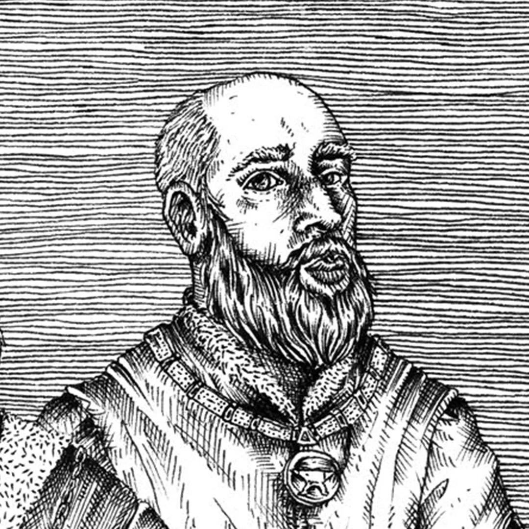
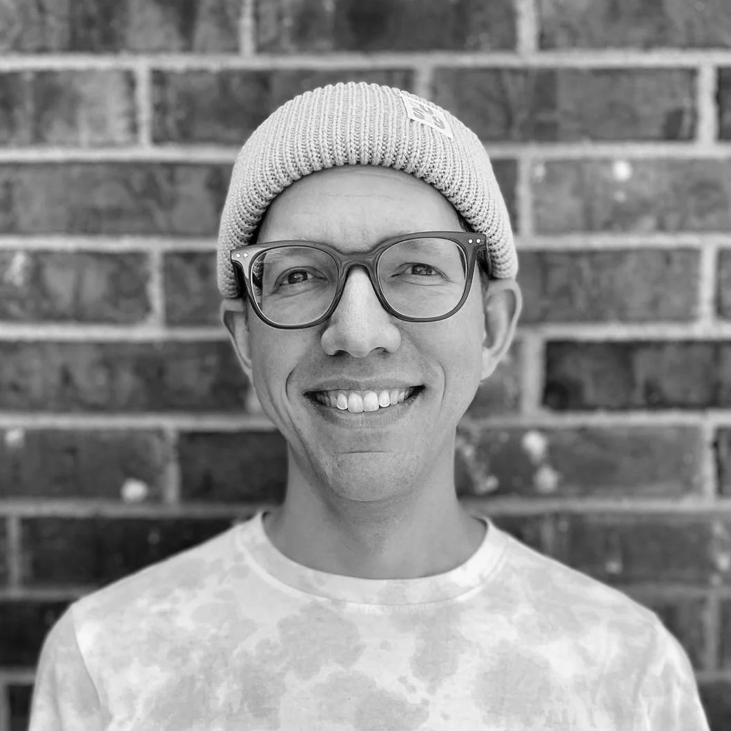
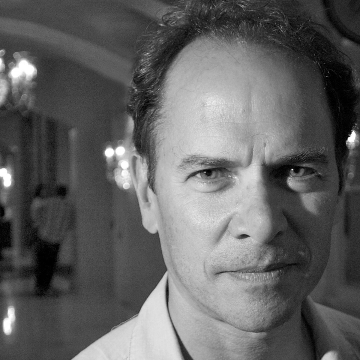
Akiem Helmling
Zealotry wouldn’t be an inappropriate collective noun for Underware. They not only design typefaces, they live type—they educate about type, they publish about type, they talk about type, they want (and organise) others to talk about type. There is an inherent honesty to their enthusiasm that betrays no snobbery—they simply think that type is very interesting and that everyone, given the chance, might think so too. Their work is among the most popular of independent type foundries—happy-go-lucky, high-quality, text-friendly typefaces for both display use and comprehensive typesetting. Underware’s typefaces stand out thanks to unique aesthetics, finished quality, and a considered collective presence.
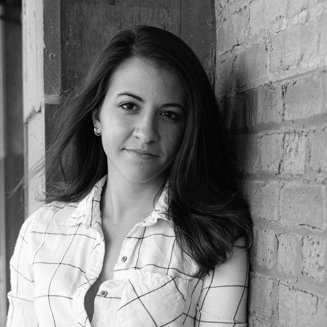
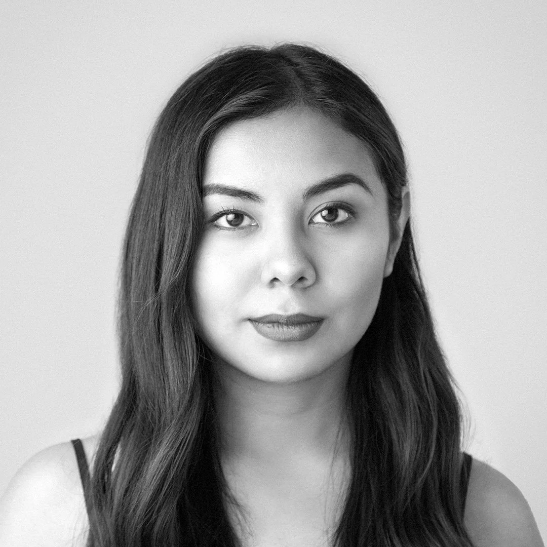
Amira Hegazy
Amira Hegazy makes images, objects, books, and texts. Based in Chicago, Illinois, she teaches design practice, history and theory at the University of Illinois Chicago and Columbia College Chicago. She is curating Letters Beyond Form at the Design Museum of Chicago. This exhibition looks at typography in Chicago’s neighborhoods to investigate design legacies and their contemporary echoes, especially considering alternative modernisms and Love as an organizing principle. Amira has an MFA in Printmedia from the School of the Art Institute of Chicago and a BA in Studio Art and Sociology from Washington and Lee University. Amira is from metro Detroit where she grew up in American and Egyptian cultures. Experiences navigating identities, places, and cultures informs much of her work.
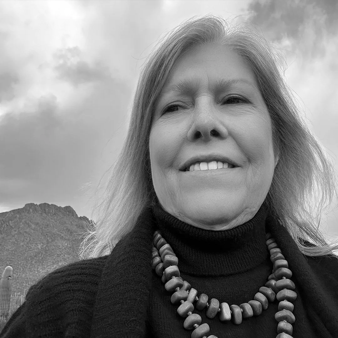
Anne Brown
Anne Brownfield Brown is a design champion, educator and avid photographer. After a 40-year career in design and communications for Twin Cities Fortune 500 companies, she left the corporate world to complete her Masters degree in 2020. A year later, she exchanged the snowy fields of Minnesota for a warm spot in the Sonoran desert. She believes in the power of visual communication and is committed to sharing her knowledge with the next generation of designers. She writes designer bios for Wikipedia and posts about design history on Instagram. Currently, she teaches at Central Arizona College and Pima Community College.
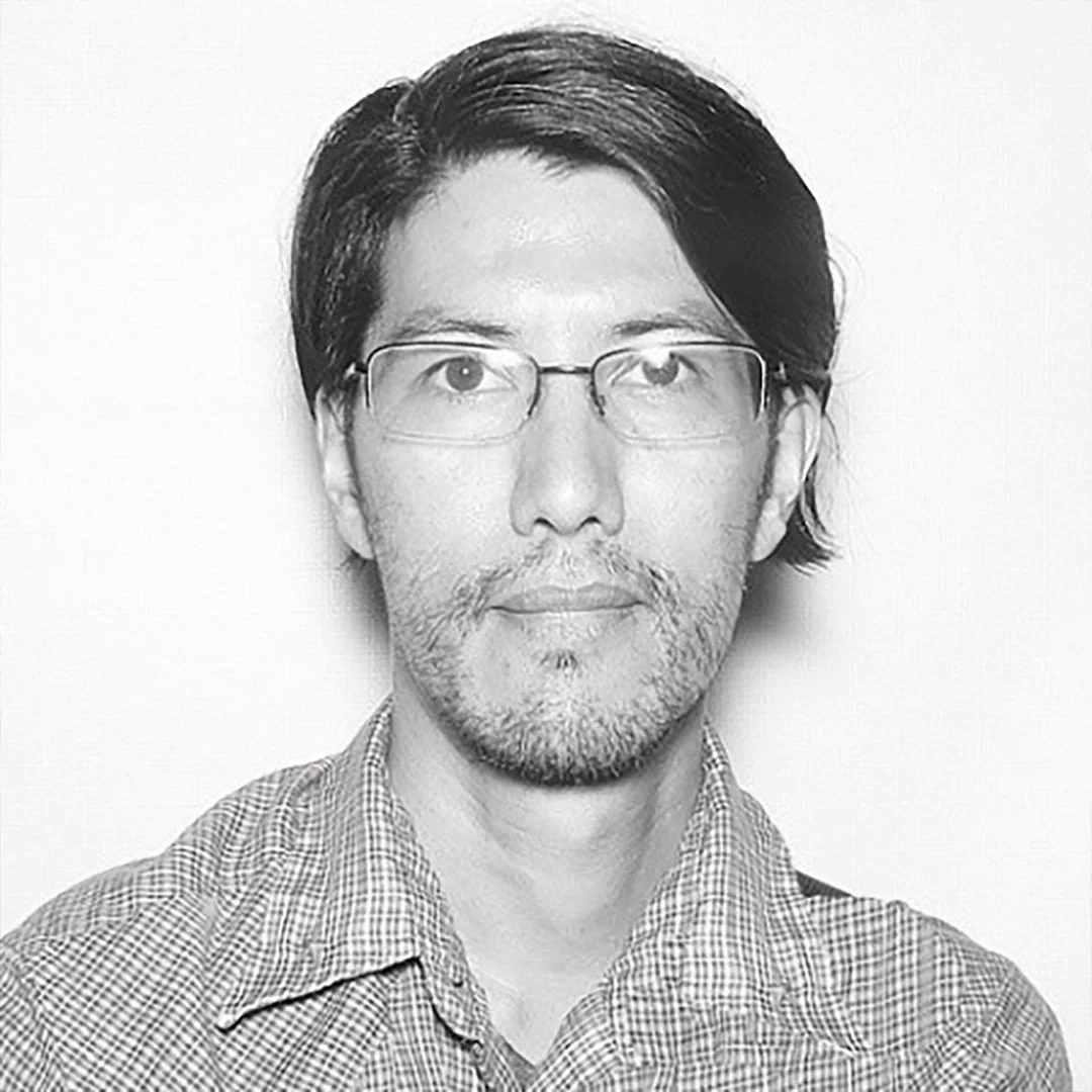
Anthony DelRosario
Anthony DelRosario was born & raised in Memphis and now lives in New Orleans. He completed the historic preservation program through Tulane School of Architecture and currently works for Tulane University Libraries. As an artist, Anthony is a cultural documentarian capturing and interpreting the culture hidden in everyday life through photography, printmaking, and digital design which he presents to the public at NOLA ’Nacular Studio & Gallery.
Chris Skillern
Chris Skillern is a type designer and citizen of the Cherokee Nation from Tulsa, Oklahoma. A 15-year-long obsession with drawing type led Chris to Type West, the Letterform Archive’s type design certificate program, in 2021, where he designed Meli, a type family inspired by his daughter, which supports the Latin alphabet and the Cherokee syllabary. Since graduating from Type West, Chris has had the opportunity to work with foundries like A+ and XYZ Type on custom type projects for brands big and small. When not assisting other designers, he stays busy with his own foundry, Tulsey Type, which features his friendly, lively, and detailed designs for Latin and Cherokee. He is currently working with the Cherokee Nation Language Program and Typotheque on new fonts for the syllabary.
Filip Blazek
Filip Blažek (1974) is a graphic designer, typographer, teacher and writer. He graduated from the Faculty of Fine Arts at Charles University in Prague. Since the mid-1990s, he has been focused on Czech typeface design and typography. He has lectured on these topics at the Academy of Art, Architecture and Design in Prague and at ARCHIP, as well as at numerous Czech and international conferences. He is actively involved in graphic design in the Designiq studio, which he founded in 2002. He is the author of the publications Practical Typography (2000, together with Pavel Kočička) and Typokniha (2020) and has contributed to numerous other publications and periodicals.
Frida Medrano
Frida Medrano is a Mexican type and product designer based in San Francisco, California, currently working as Art Director at Kettle. She finds her creative spark in optimizing and crafting systems, particularly in design automation. Working with letters is more than a passion for her; it’s the lens through which she understands design and technology. In her perspective, Type is the perfect space where code and design converge, shaping her work philosophy and guiding her through the automation process in her projects. She won the 2018 SOTA Catalyst Award and has presented her work in forums like TypeCon, DesignMatters, ATypI, TypeLab, IxDA, Letrástica, and TMX.

Kamilé Demir
Kamilé Demir is a Computer Scientist at Adobe Fonts & Type, specializing in font development and testing tools. She actively contributes to the Unicode Consortium, representing Adobe in the Unicode Emoji Standard & Research Group, and also serves as Adobe’s secondary representative to the Unicode Technical Committee. As one of the newer members of the Unicode Consortium, Kamilé is interested in sharing her learnings and experience with others, regardless of their familiarity with Unicode-related topics.
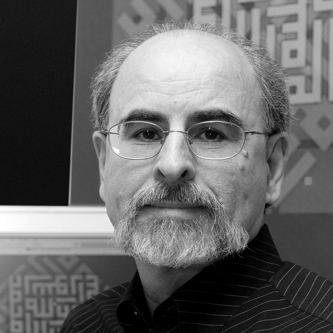
Mamoun Sakkal
Dr. Sakkal is founder and principal of Sakkal Design in Bothell, Washington. After a career as an artist and architect, in the 1990s he turned his attention to Arabic calligraphy and typography. He has received several awards for calligraphy, graphics, and type design including six awards of excellence from the Type Directors Club of New York and one from IRCICA in Istanbul. Clients include National Geographic, Microsoft, Linotype, Adobe, and Bitstream among others. Sakkal Design was commissioned to design the corporate Arabic typefaces for Burj Khalifa and Armani Hotel in Dubai, and several of his Arabic fonts are now widely used as Windows system fonts. His 2010 PhD dissertation was a comprehensive study titled “Square Kufic Calligraphy in Modern Art, Transmission and Transformation.”
Mark Jamra
Mark Jamra is a type designer and former professor of graphic design, who has designed and produced typefaces for over 40 years. He is the founder of TypeCulture, an online type foundry and academic resource, and is a founding partner of JamraPatel, a studio creating innovative type systems with multiple scripts for use in under-supported language communities. Mark has taught letterform and type design at colleges and in workshops in the U.S. and Germany. His typefaces have received recognition from the TDC and the Association Typographique Internationale (ATypI).
Min-Young Kim
Min-Young Kim is a trilingual typography consultant, project manager, and a researcher specializing in CJK-Latin typography. After completing her Master’s degree at Musashino Art University on history & modern usages of CJK-Latin multiscript typesetting, Min developed her career in font business as a type project manager at Japanese type foundries: Morisawa and Fontworks. She established Studio Em Dash in 2020, with a focus on multilingual type development and typographical consultancy.
Neil Patel
Neil Patel is a type designer and former semiconductor process engineer based in Portland, Maine. He is the founder of Tetradtype, an independent type foundry, and a founding partner of JamraPatel, a studio which focuses on typefaces, keyboards and apps for indigenous scripts. Neil’s collaborative logotype designs with local studios have been featured in How Magazine and Comm Arts. He has also been known to dabble with programming, which he ties back into his design practice.
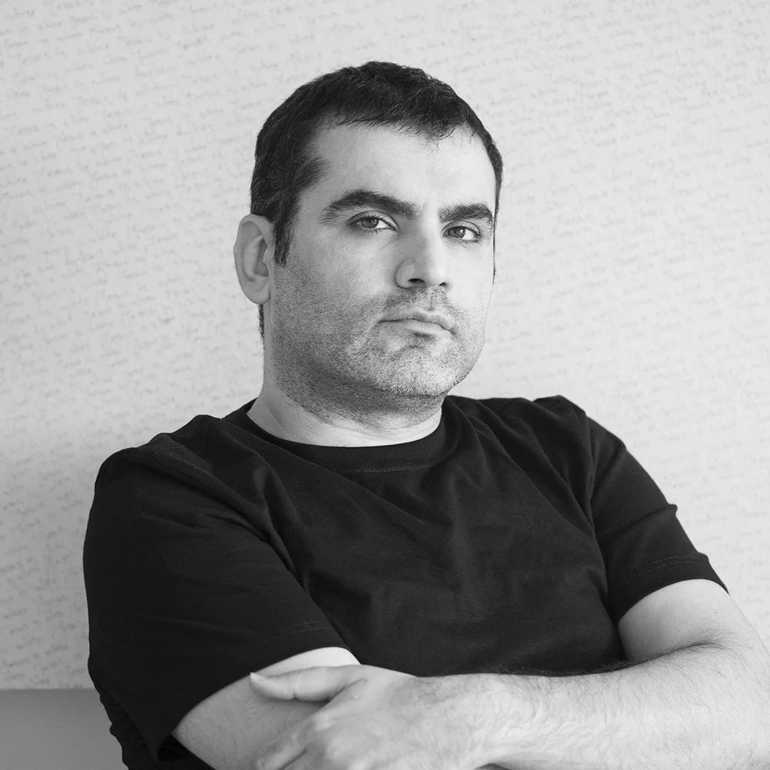
Radek Sidun
Radek Sidun (1980) devotes himself primarily to fonts and typography. He is a sought-after consultant to font designers and type foundries worldwide. He’s served as a pedagogue at the Type Design and Typography studio of the UMPRUM Academy in Prague. He lectures on contemporary typography and its recent history at the same institution. Together with Tomáš Brousil, he founded Briefcase Type Foundry in 2012. He has received several awards for his projects. He is a member of the editorial team of the award-winning book TYPO9010 (2015), co-author of the book Jaroslav Benda 1882-1970: Typographic Design and Typeface (2019) and author of the publication Manual of Diacritics: Case studies of newly designed accents for contemporary typefaces (2021).
Sabid Ali
As a designer, I work to amplify underrepresented voices for the purpose of creating a positive social impact. I use my passion for ‘making’ to put the work of queer designers who have come before him into the broader canon of design, and activate the current queer consciousness.
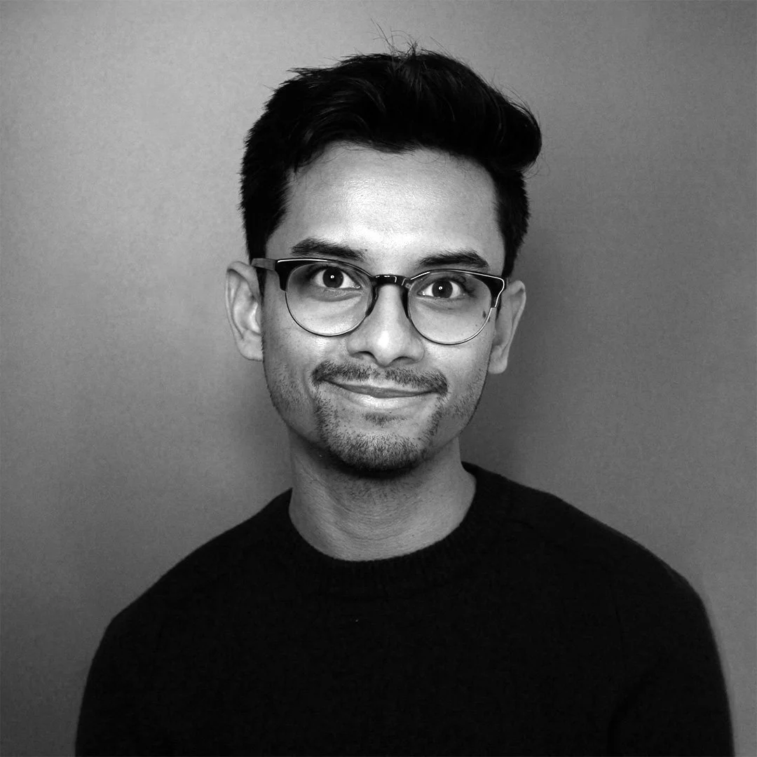
Sajad Amini
Sajad Amini is an Iranian visual artist/designer based in Chicago. Holding a BA in cinematography from SAU, Tehran, he furthered his studies with an MFA in Visual Studies from the PNCA and an MFA from the University of Oregon. Sajad’s artworks delve into his profound personal experiences, with text and language forming the bedrock of his creative practice. His pieces have been exhibited at numerous national and international exhibitions, residencies, and conferences, including CAA. As a designer, Sajad has collaborated with national and international brands, earning accolades such as the IDA, AGDA, STA, and GDUSA design awards. He has held positions as an Asst. Prof. at Georgia State University and presently serves as an Asst. Prof. at DePaul University, Chicago.
Sami Kortemäki
Zealotry wouldn’t be an inappropriate collective noun for Underware. They not only design typefaces, they live type—they educate about type, they publish about type, they talk about type, they want (and organise) others to talk about type. There is an inherent honesty to their enthusiasm that betrays no snobbery—they simply think that type is very interesting and that everyone, given the chance, might think so too. Their work is among the most popular of independent type foundries—happy-go-lucky, high-quality, text-friendly typefaces for both display use and comprehensive typesetting. Underware’s typefaces stand out thanks to unique aesthetics, finished quality, and a considered collective presence.